MoneyFly
UX/UI Design Case Study
Brief
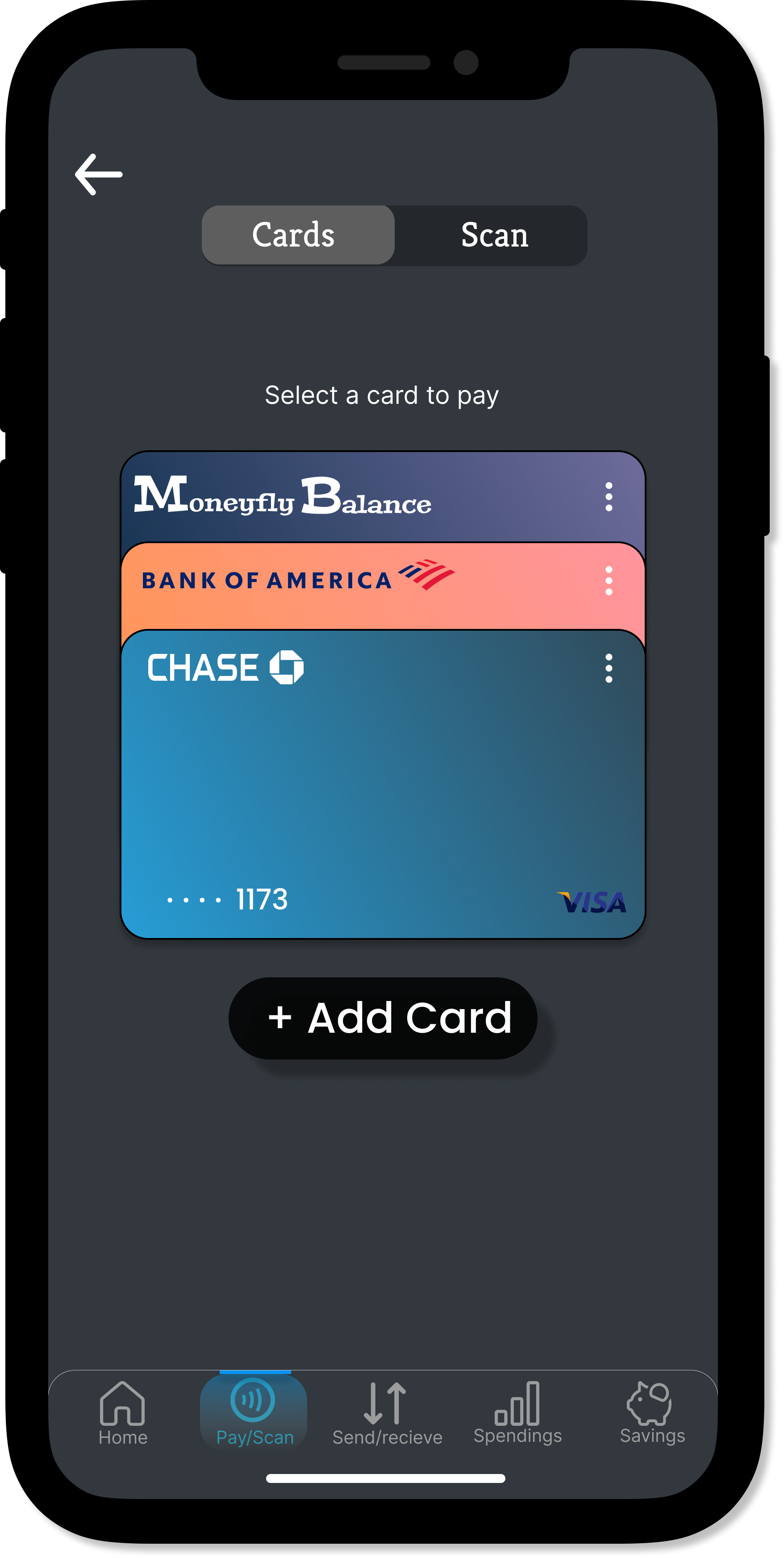
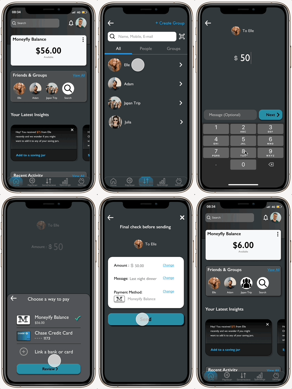
MoneyFly is a money transfer and management app that allows users to transfer funds to friends and family, track and manage spending done across bank accounts and cards from one place, plan their savings and make contactless payments at stores and restaurants.
Role
As the sole Product Designer, I worked on the entire product design from initial research to conception, visualization and testing.
Tools
Figma, Usability Hub, Google Forms, OptimalSort, Lucid Chart, Zoom, Adobe Color
Challenges
1 out of 5 young adults is not confident managing money.
Struggle to access the monthly statements and track the past transactions when using multiple cards and banks.
Transferring funds to friends and family online with total transparency, efficiency, and security.
The inconvenience of carrying physical cards and cash.
It’s difficult for many millennials to plan for short-term savings or save for a deposit to rent or buy a property or car.
Solution
Design an experience which would give a fresh way to better the financial health.
Providing a safe and secured way of carrying and paying using one’s phone.
Transparency in everything and making sure users won’t have to pay fees.
Help users reach their goals with personalized insights, easy access to spending and transactions with customized searches based on date, businesses and categories.
Saving Jars (like piggybank) for users to set custom saving goals.
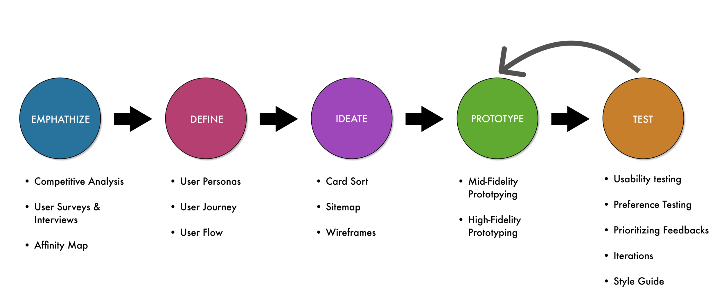
Design Process I used
Empathize
Competitive Analysis
I started my exploration of this project by doing a competitive analysis of products that were already on the market.
Venmo
Venmo has emerged as one of the most popular apps for electronically transferring funds from Peer-to-Peer.
With a genius setup, the entire Venmo program is set up to capitalize on word of mouth as its main growth marketing engine. People use the app name as a verb like your friend says, “Just Venmo me!” This informal introduction makes downloading a mobile money-sharing app seem like a no-brainer.
Paypal
Paypal offers payment services and solutions for both personal consumers and businesses.
Paypal competes in the digital payment space by expanding itself by offering more products and services to businesses and consumers than others. It acts slightly more like a bank than mere app which gives them an extra advantage.
There’s one thing that gives Paypal an upper edge from its competitors’ uprising is that banks are increasingly encouraging their customers to add their credit cards to Paypal, strengthening the competitive advantage Paypal’s wallet provide.
User Research - Survey and Interviews
After experiencing competitors’ apps as a user myself, now it was time to know about the experience good and bad with the genuine users of these digital payment services.
I first conducted user survey using Google Forms to get straightforward analysis and visualization of the bigger picture which actually helped me prepare set interview questions.
User Survey
Research Goals
Discerning how frequently people use digital payment and banking apps.
Determining which digital payment apps people use and what they use those apps for.
Understanding people’s attitude towards digital payment methods and Digital payment apps
Findings
User Interviews
In order to learn about the real experiences people have had while managing and transferring money online , I recruited 3 participants (fitting within the criteria of the provisional personas) for user interviews. Here, I focused on asking open-ended questions about their experiences to learn as much as possible about our users and validate my understanding of them from my provisional personas.
Research Goals
To better understand user behavior around the activity of digital payment, management, and few other prominent functionalities of such apps.
Collecting data on the context in which users would use a digital payment app.
Documenting user pain points with existing financial apps on the market.
Affinity Mapping
To synthesize all the information I had gathered from the user interviews, I wrote my findings on sticky notes and created an affinity map. By identifying common patterns across my findings, I was able to uncover key insights which helped me understand who MoneyFly’s users are and what they truly need.


Findings
People use these apps for many things like keeping track of expenses, online/offline shopping, transferring funds to friends & family.
People prefer to use 1-2 apps for everything, they’d like if more of the banking app features and a few other important features are incorporated into the digital wallet app without making it too overwhelming for them.
For some people reputation of the company/app matters the most while trusting the app. People trust GooglePay, PayPal, and ApplePay the most for the same reason.
Most people would like to save money but feel it difficult and tend to spend it.
Cash is almost obsolete and people find no point in using it.
Users find it a hassle to keep track of spending from different bank accounts and cards.
Users don’t want features such as investments and cryptos incorporated in the payment app.
Define
User Personas
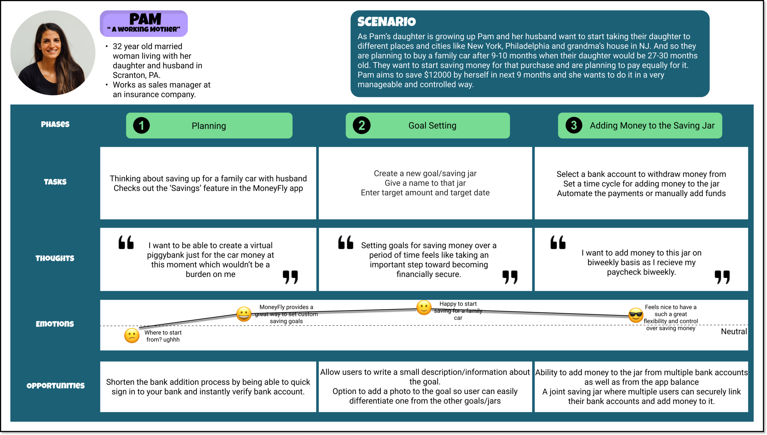
To deeply understand users’ needs and goals, User Persona was a great tool to make all data really come alive for the project with the goal of giving my research a human face and narrative.
User Journey
User journey maps were created as narrative documents to display the process Annie and Pam would walk through as they complete a task within the app. These journey maps show Annie’s process as she sends money to her brother on receiving the money request and Pam’s process of planning and setting up a goal to save up money for a family car.
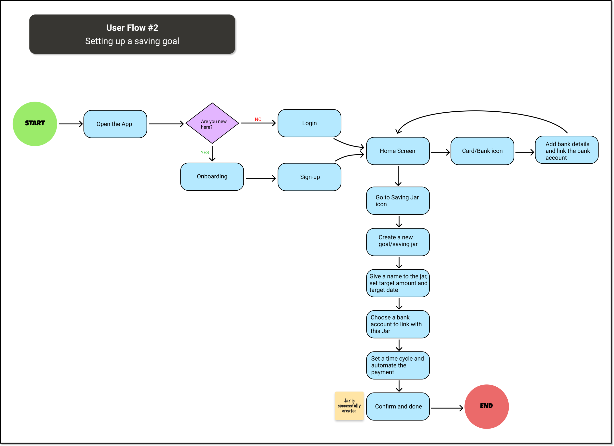
User Flows
With the help of User Flows, I explored possible pathways users would take to accomplish tasks within my app. Creating them made me think about how I could incorporate some of my main objectives - ease of use and quick access and showed me what to look out for when drafting my initial sitemap.
Ideate
Card Sorting
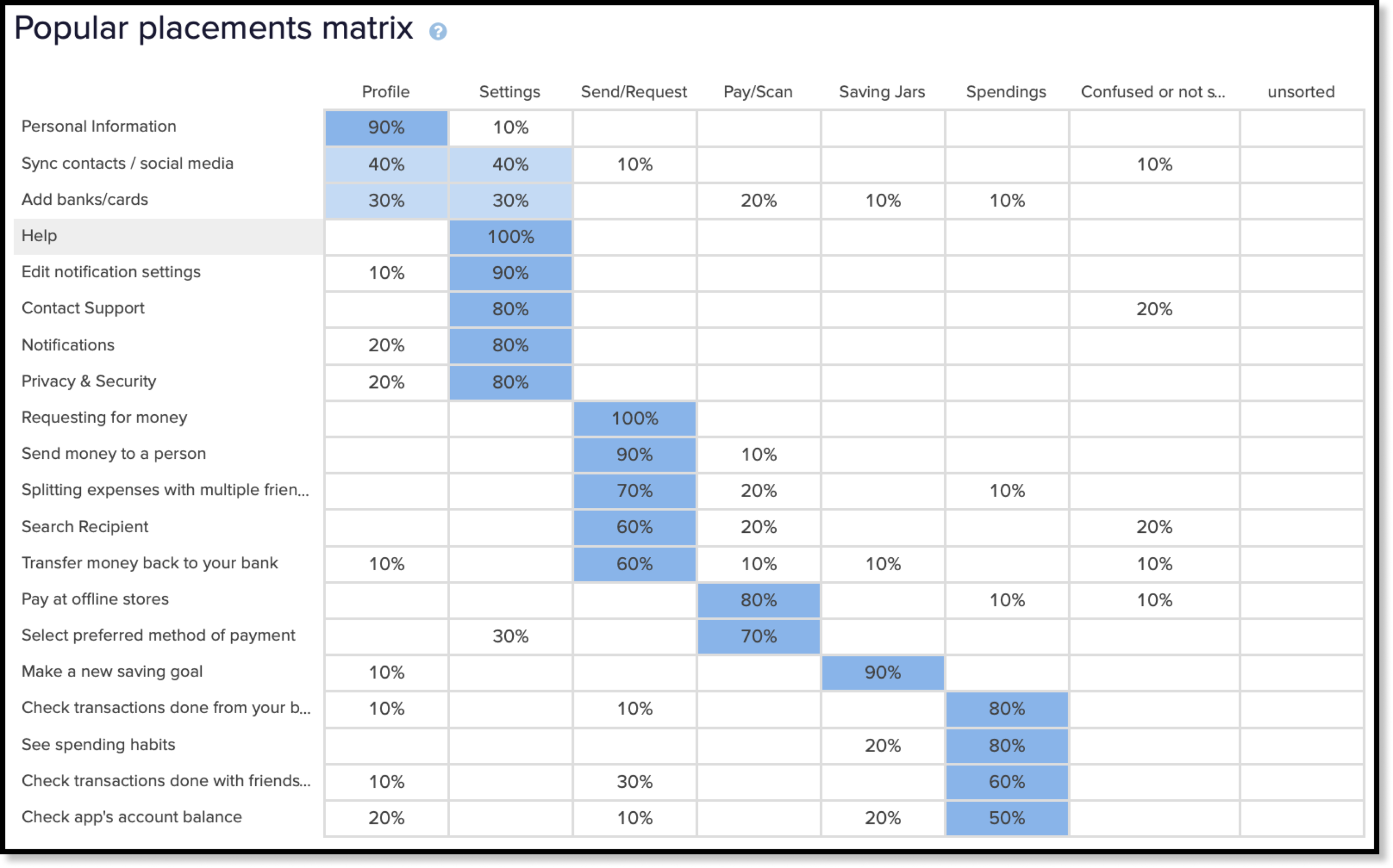
The next step in the design process was to make a sitemap to have a visual overview of the hierarchy of the app. To improve the original sitemap, a card sort was performed. This is to show how users organize content. I had 10 participants sort through the content of MoneyFly.
Insights from Card Sorting
I could quickly see high agreement for some categories.
One thing that I found very interesting and valuable out of this activity is that people would like to link their banks & cards from all over the place, what I mean is people would like to be able to link banks/cards for depositing, withdrawing, and managing spendings from different screens dedicated to each feature that they use the app for and not just the traditional way of linking it through the option in settings.
Surprisingly people didn’t confuse themselves between the option Pay/Scan and Send/Request which is a very big positive for us.
Some of the participants placed the card ‘Check transactions done with friends and family in the ‘Send/Request’ category which says a lot about how people like to access a few things from all over the app.
7/(20*10) cards were placed under the ‘Confused or Not sure’ category and none were left unsorted.
Sitemap
Through this card sorting task, I have noted some potential issues with how I have mapped out my app and have discovered opportunities for improvement such as putting some features under multiple categories so users have many access points based on their preferences. Also, we were able to locate errors in the previous sitemap and figure out key features that needed to be added. I revised my sitemap by accommodating the new learnings from the card sort activity.
Low Fidelity Wireframing
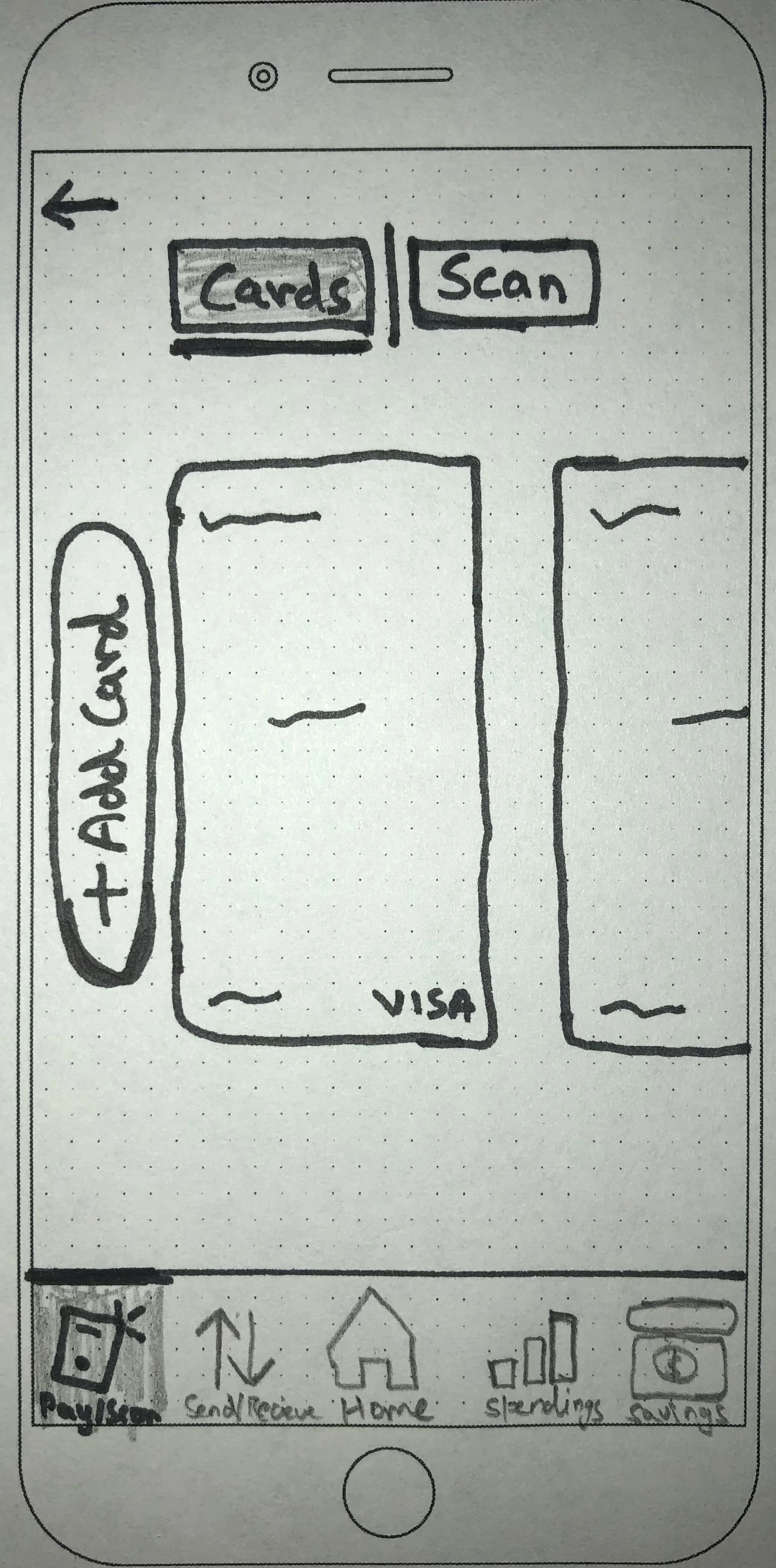
With the key features and user flow defined, I started to capture my ideas by sketching low-fidelity screens using pen and paper. It enabled me to examine my ideas before moving onto digital wireframes.
Home
Pay/Scan
Contacts
Send/Request
Mid Fidelity Wireframing
Now that I had sketched out my ideas, I wanted to test the decisions I made and make sure that the structure and flow of the app is intuitive for our users. Before working on the visual design, I wanted to first make sure that the design was functional. In order to do this, I decided to create a mid-fidelity prototype which would help me quickly test the design on real users and make any priority revisions before integrating the branding and visual design.
Onboarding Screen
Send/Request
Login
Money Sending
Home
Saving Groups
Pay/Scan
Goal Setting
Prototyping & Testing
Usability Testing
Once I designed a mid-level prototype, I was ready for the first round of user feedback and iteration. So I went on to carry out moderated usability testing with 6 participants.
I have included the Usability Test Plan, LINK
I have also included the Usability Test Script, LINK
Affinity Map
Rainbow Spreadsheet
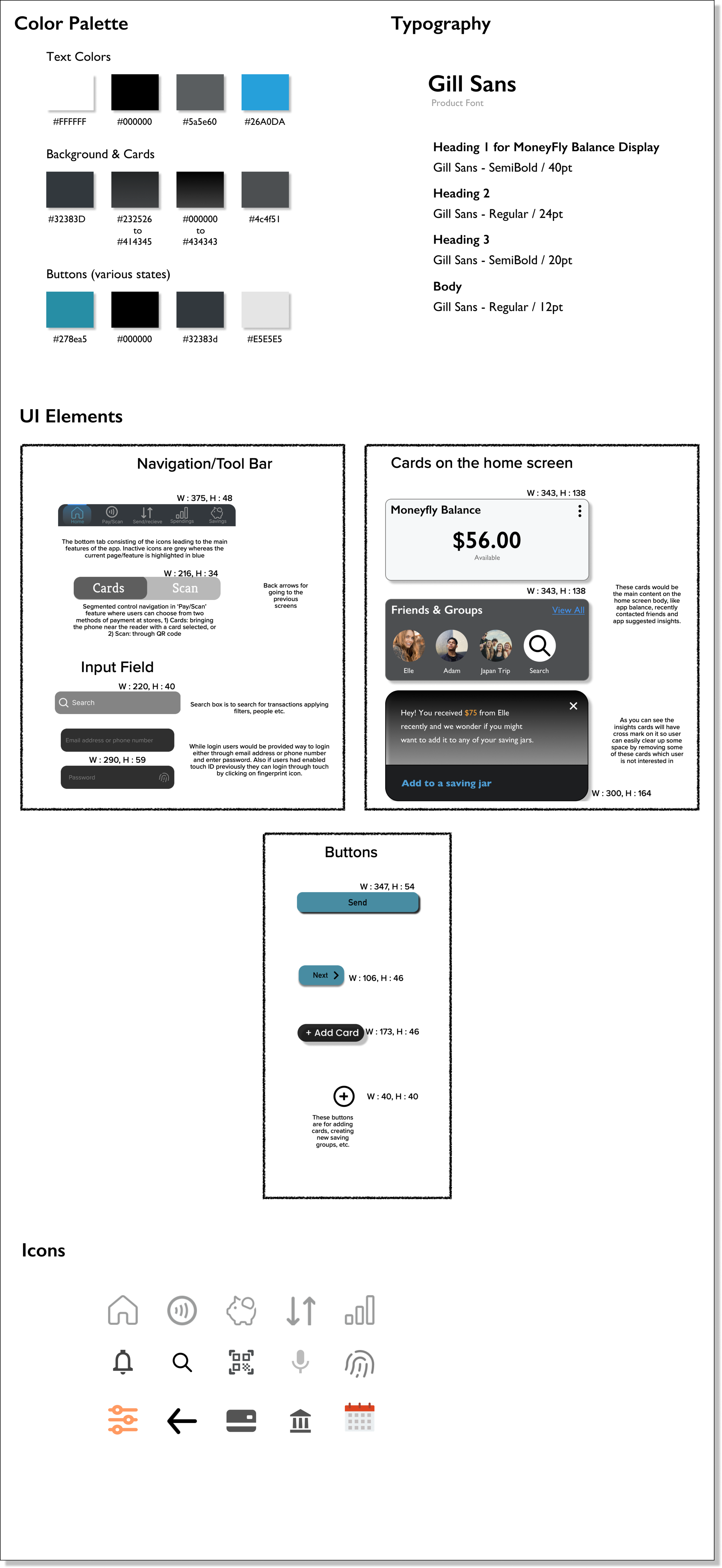
Style Guide
Finalized Design
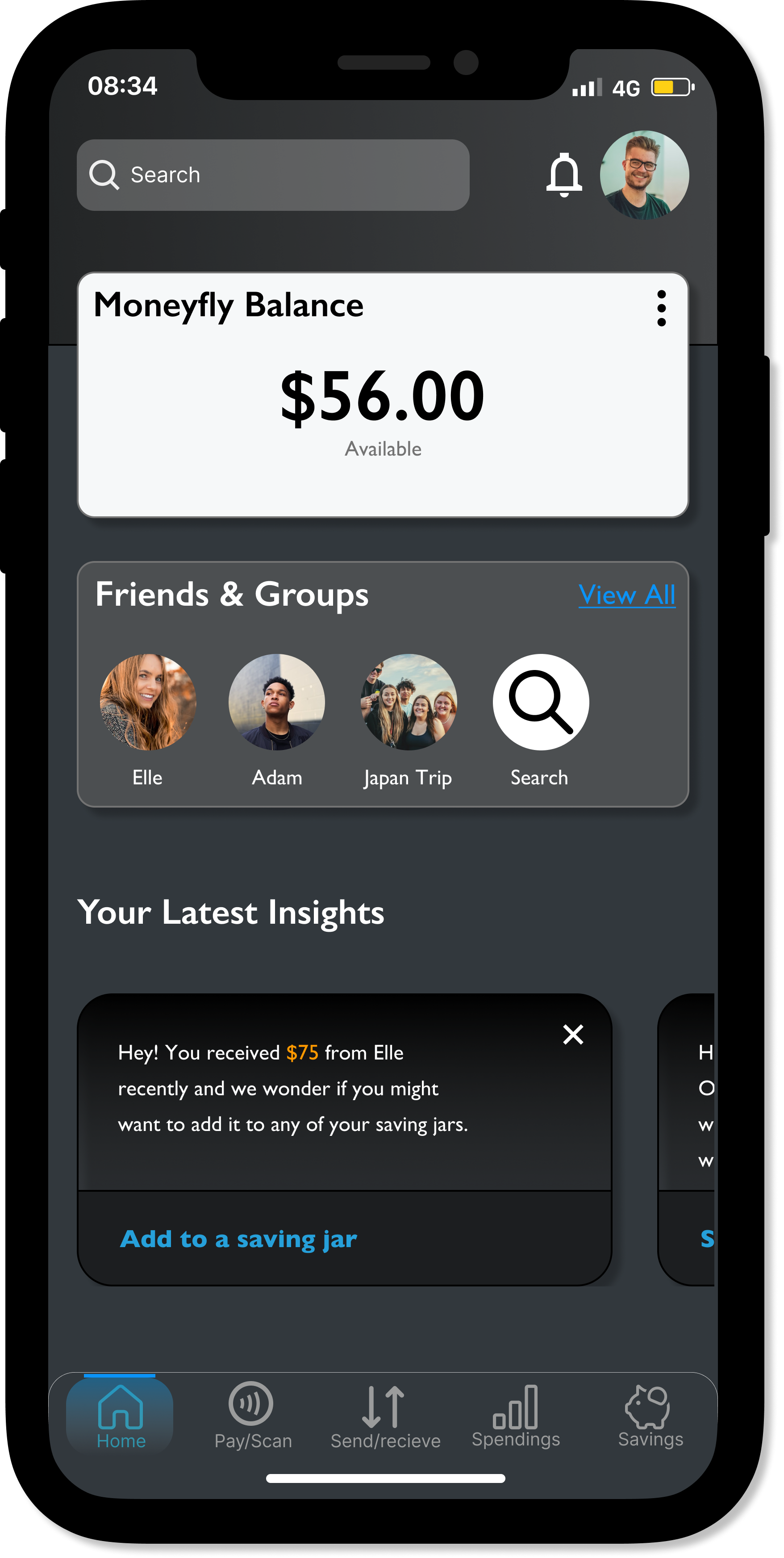
Taking my revised wireframes, I now worked on creating final, high-fidelity wireframes and created a final prototype. This included making adjustments for accessibility, receiving feedback from peers that ensured visual consistency and clarity throughout the design.
Home
Saving Groups
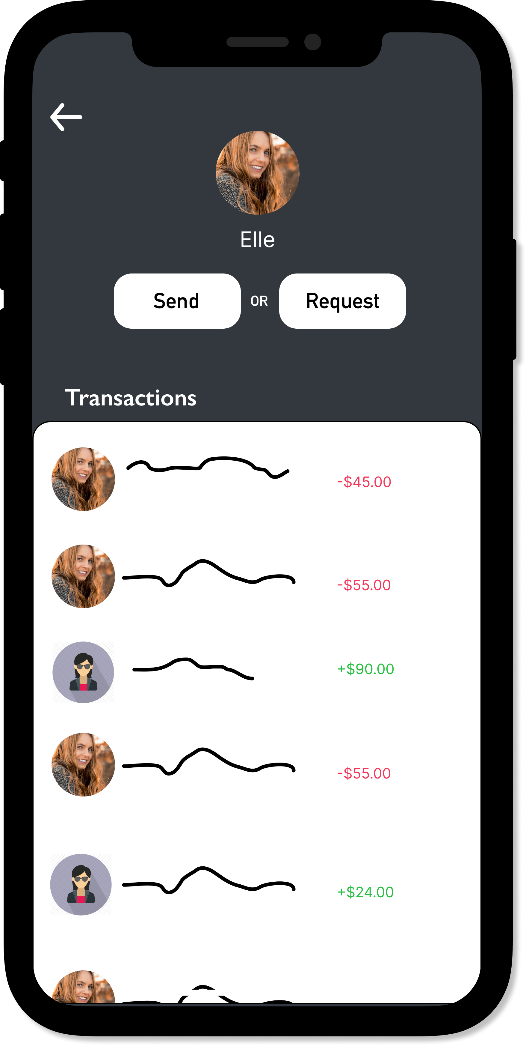
Money Transfer
Banks & Cards
Spending
Sign-up
Wallet
Sending money
Final Prototype
Takeaways
There are many great ideas, always select the one that will add the most value to your product and your user.
Each step facilitates the next — trust the process.
Test Test Test - I learned to take on feedback and being empowered by the comments and thoughts people have has been eye-opening. I have found myself being able to develop the product to a much higher level.
Future Directions
Future Considerations
- I would be looking at the data from the initial days and months to see if we met our criteria for success.
- Regular testing to keep improving and perfecting the UX and UI of the app.
- Research every 5-6 months to stay aware of new user needs and behaviors, to look for new ways to innovate.
Exploratory Concepts
- Would work on a group/expense splitting feature that will help users keep track of their shared expenses and balances with housemates, trips, groups, friends, and family.


